Lumify Energy
A portal for landowners hosting renewable generation — turning eighteen years of turbine output into two questions a non-specialist actually asks: is it working, and what am I owed?
The client and the user
Lumify Energy are specialists in renewable energy payments, helping landowners fully benefit from the renewable energy produced on their land.
That sentence conceals the design problem, so it is worth unpacking who the user is. Not an energy trader. Not an asset manager with a Bloomberg terminal. A landowner — typically a farmer or an estate — who at some point signed a long lease letting somebody put turbines or panels on their field, and who is now owed money based on how much those machines generate.
They are financially exposed to a piece of industrial infrastructure they do not operate, cannot inspect, and were never trained to assess. And the data that describes it arrives in the vocabulary of the energy industry: megawatt-hours, capacity factors, output efficiency percentages. The product's job is to stand between those two things.
So the interface has to answer two questions, in this order, for someone who is not an engineer:
- Is it working properly? — and specifically, is this year normal, or is something wrong?
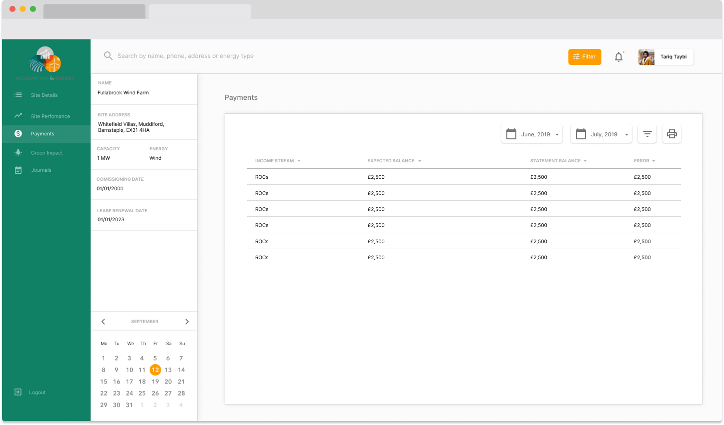
- What am I owed, and does it match?
Translating the unit
The most important decision in the whole design is visible in the charts, and it is a translation.
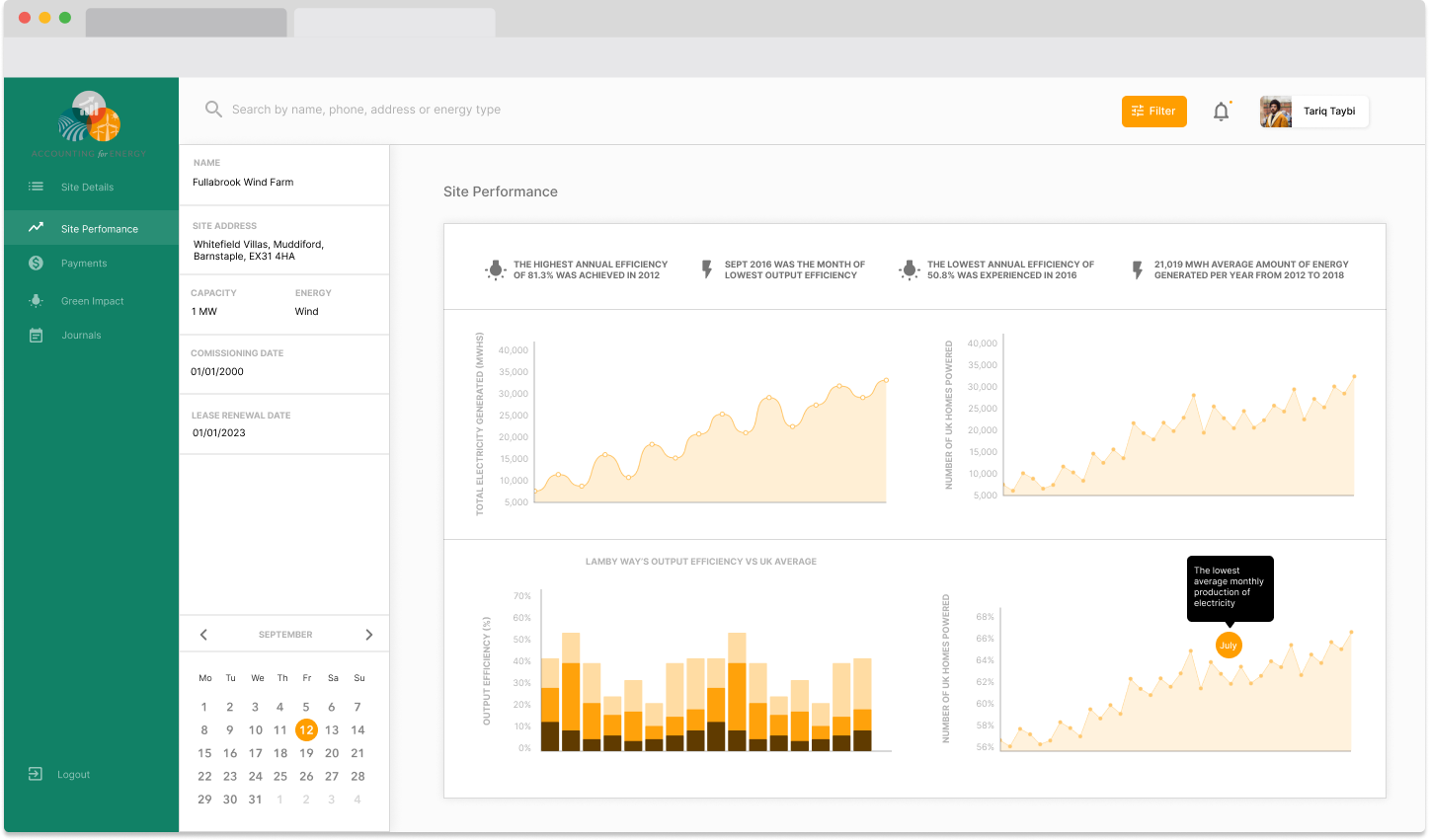
Generation is plotted twice: once as total electricity generated in MWh, and once as the number of UK homes powered. Same data, two axes, side by side.
Megawatt-hours are the correct unit and they are meaningless to almost everyone. "21,019 MWh average amount of energy generated per year from 2012 to 2018" is a fact you cannot feel. Homes powered is not a more accurate unit — it is a derived figure and it hides real assumptions about average household consumption — but it is a unit a person can hold. It converts an abstract quantity into a mental image of a town.
Showing both is the honest version of that move. Give the industry number for anyone who needs to reconcile it against a statement, and the human number for everyone else, and let the reader see they are the same series. Replacing MWh entirely would be patronising and would break the ability to check a payment; showing only MWh would be technically correct and useless.
Conclusions above the charts
Along the top of the performance view sit four written findings rather than four numbers:
| "The highest annual efficiency of 81.3% was achieved in 2012" |
| "Sept 2016 was the month of lowest output efficiency" |
| "The lowest annual efficiency of 50.8% was experienced in 2016" |
| "21,019 MWh average amount of energy generated per year from 2012 to 2018" |
This is the pattern I would carry into any dashboard for a non-specialist. A chart shows you a shape; it does not tell you what the shape means, and it certainly does not tell you which part of it matters. A landowner looking at eight years of monthly output has no baseline for "good" — they cannot know whether a dip is weather, a maintenance window or a failing gearbox.
Stating the best year, the worst year, the worst month and the long-run average does the comparison for them. It gives them the range their site actually operates in, which is the only context in which this year's number becomes readable. The charts below then let them verify the claim rather than take it on trust — which is the correct order: assert, then evidence.
One chart goes further and compares the site's output efficiency against the UK average. That is the single most useful view in the product, because it separates the two explanations a bad year can have: everyone had a bad year, or you did.
The tooltip that says what it means
A callout on the seasonal chart reads: "The lowest average monthly production of electricity", pointing at July.
It is a small thing and it is doing real work. July being the weakest month for wind is counter-intuitive to anyone who has not thought about it — it is the sunniest month, and the instinct is that summer means more energy. Without the annotation, a landowner seeing a summer trough would reasonably suspect a fault. The label converts an alarming shape into a seasonal fact.
Annotation is chronically underused in product dashboards. Editorial charts have used it for a century, because a journalist knows the reader has no context. A landowner has less context than a newspaper reader, not more.
The site panel, and why the lease dates are on it
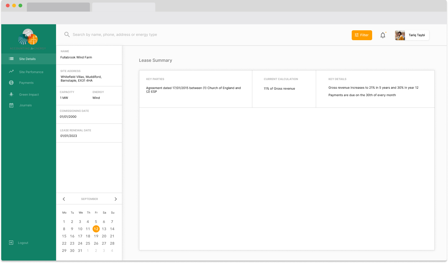
The left column holds the site's identity: name, address, capacity, energy type, commissioning date — and, notably, the lease renewal date.
Putting a commissioning date and a lease renewal date on the same panel as the performance data is a piece of product judgement rather than layout. Together they frame every number to their right. A site commissioned in 2000 is a mature asset whose declining efficiency is expected; the same curve on a five-year-old site is a problem. And the renewal date is the one piece of information on the screen with a deadline attached — it is the moment the landowner's negotiating position is decided, and it is exactly the sort of date that lives in a filing cabinet and gets remembered too late.
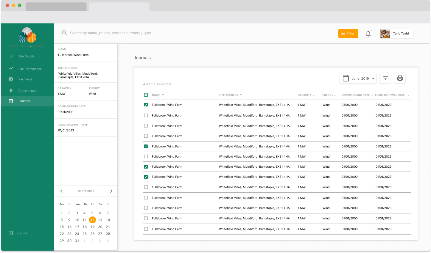
The navigation follows the same logic. Site Details, Site Performance, Payments, Green Impact, Journals — four of those five are things a landowner would ask about unprompted. Green Impact is the one that is not strictly financial, and it earns its place because for many landowners the environmental argument is part of why they signed at all; giving it a section acknowledges a motive the payment statements ignore entirely.
Colour doing one job
The interface runs a green identity in the sidebar and an amber-to-brown range in the data, on white. That split is deliberate and worth naming, because the obvious temptation in a renewables product is to make everything green.
Keeping brand green out of the charts leaves the entire warm range free to encode magnitude — which is what the stacked efficiency bars use it for. If green were also a series colour, the sidebar would be competing with the data for the same signal, and every chart would carry an implied "this is the good one" that the numbers had not earned.
Search is scoped the way the user thinks: by name, phone, address or energy type — an estate manager looking for a site knows the field it is in or the person who called about it, not an asset ID.
Honest status
This is interface design work; I did not build the platform. The screens shown are the design output, and I have no telemetry on how the finished product performed in use or whether every view here shipped in this form.
The "homes powered" conversion is also worth flagging as a genuine trade-off rather than a clean win. It rests on an assumed average household consumption which the interface does not disclose, and any derived figure that hides its assumption is one a sceptical user can be wrong-footed by. If I revisited it, the number would carry its basis — either in the axis label or one hover away.
What I'd take from it
Translate the unit, but keep the original next to it. Megawatt-hours for the person reconciling a payment, homes powered for the person forming a judgement. Replacing the technical unit removes their ability to check you.
State the conclusion above the chart. Non-specialists have no baseline. Best year, worst year, long-run average and a comparison against the national figure turn a line into something readable.
Annotate the counter-intuitive. One label on a July trough is the difference between a seasonal fact and a suspected fault.
Put the deadline on the screen. The lease renewal date has no place in a performance view by any tidy information architecture, and it is the most consequential thing on it.