Tinder
An interface study for a dating app, built around one addition: a track on every profile. What a person picks as their anthem says more in three seconds than a bio does in thirty.
The premise
A dating app's card is one of the most constrained surfaces in consumer software. You get a photograph, a name, an age, an occupation, perhaps a line of text — and on that a person makes a decision in under two seconds and then repeats it a few hundred times.
The failure mode of that surface is well known: it collapses to a judgement on the photograph, because the photograph is the only element with enough bandwidth to carry anything. The written bio is supposed to be the counterweight, and it does not work — not because people cannot write, but because everyone is writing to the same brief under the same social pressure, so the bios converge. They are the least differentiating field on a screen full of them.
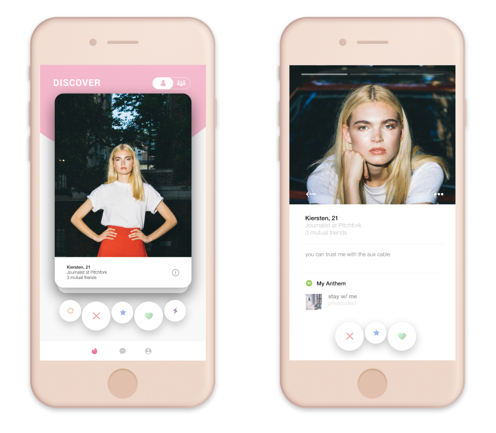
This study keeps the familiar structure — a Discover deck, a card, a detail view, the swipe-adjacent action row — and adds one field.
My Anthem
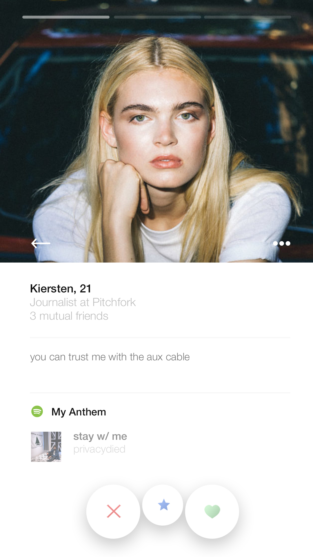
Each profile carries a track, shown on the detail view under the heading My Anthem, with the artwork, title and artist.
This is the whole idea, and the argument for it is about bandwidth per second of attention. A bio is text you have to read, evaluate and discount for self-presentation. A track is an artefact somebody chose. It carries genre, era, and the specific social information that music has always carried — and it is consumed in about three seconds, which is roughly the budget available.
Two properties make it better than the bio at the same job:
It is harder to write to the brief. Everyone knows what a good bio sounds like and can produce one. A track is a real commitment to a taste, and the choice reveals something whether the person intends it to or not — including, usefully, when someone picks something calculated. A safe anthem is itself informative.
It is a conversation opener that is not about appearance. The hardest part of these products is the first message, and the default opener is a comment on a photo. A shared or opposed music taste is a subject, which is a materially better starting position than a compliment.
The bio field survives alongside it, and the sample copy in the mock — "you can trust me with the aux cable" — is doing something slightly sly: it demonstrates the feature in the voice of someone who already thinks this way about music. The two fields are meant to work together rather than compete.
What the structure gets right, and where the study pushes
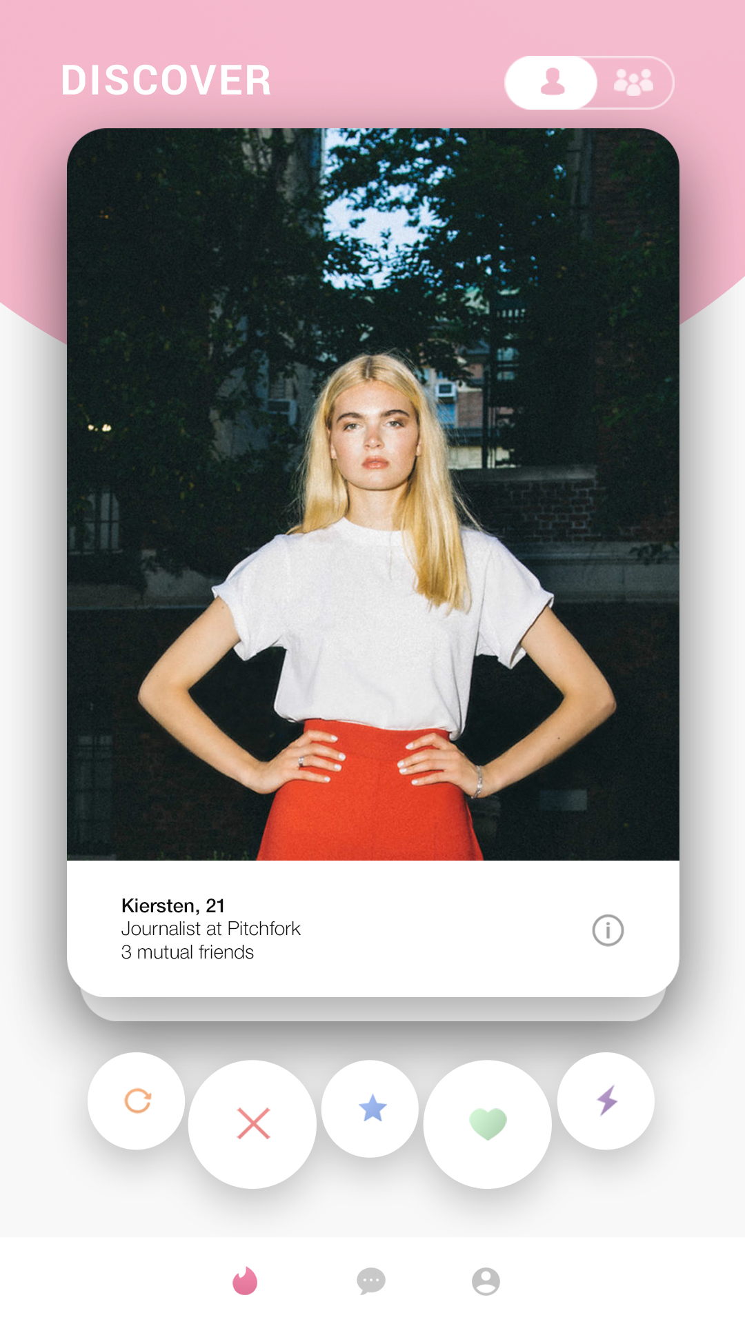
The deck stays a deck. The Discover view keeps a single card with the action row beneath it, rather than a grid. A grid invites comparison, and comparison is exactly what turns this category into a ranking exercise. One card at a time is a slower, better instrument, and it is the reason the format persists despite everyone complaining about it.
The individual/group toggle at the top. A small control switching between solo and group modes acknowledges that the reason people are on these apps is often social rather than romantic — and that going out as a pair or a group is a completely different intent with the same underlying mechanics.
Progressive disclosure into the detail view. The card carries the minimum — photo, name, age, occupation, mutual friends — and the detail view adds the bio and the anthem. That order is right: the card's job is to earn a tap, not to make the case.
Mutual friends on the card, not buried. "3 mutual friends" is the strongest trust signal available on the surface, and it is doing more work for safety and for conversation than anything else in that block.
The visual treatment
The study runs a soft blush and pink palette on white, with a rounded card, generous corner radii and a row of circular action buttons in distinct colours — rewind, pass, super-like, like, boost.
Two things worth noting about that. The action row uses shape and colour together rather than colour alone, which matters more here than in most interfaces: these are irreversible, high-frequency decisions made with a thumb at speed, and a red-green pair distinguished only by hue is a genuinely bad idea for the substantial minority of users who will not reliably separate them.
And the photography is presented full-bleed inside the card with the text block beneath it on a solid ground, rather than as text overlaid on the image. Overlaying is the more fashionable choice and it fails constantly in this category, because the images are user-supplied and cannot be art-directed — any given photo may be bright exactly where the name sits. A solid block under the image is less elegant and always legible.
Honest status
This is an interface study, not a shipped feature and not commissioned work by the company whose product it references. The screens are the deliverable; there is no engineering behind them, and no user research was run to validate the central idea.
The idea also has real problems I did not solve. A track per profile needs a music service connection, which is an extra permission and an extra account link at signup — precisely where these products lose people. It privileges users who care about music and gives everyone else another empty field to feel bad about. And playing audio inside a browsing flow that people very often use in public, silently, is an awkward fit — the artwork and title do most of the work, which rather concedes that the audio itself may be optional.
I would also now want to know whether the anthem gets used as a filter. Making it a matching input rather than a display field is a much bigger product change than it looks, and probably a worse one — taste-matching sounds appealing and mostly produces a narrower room.
What I'd take from it
Add the field with the highest information per second. On a surface where attention is measured in seconds, the question is not "what else could we show" but "what carries the most meaning fastest". A song beats a paragraph.
The best fields are the ones people cannot write to the brief. Bios converge because everyone knows the format. An artefact somebody actually chose resists that.
Never encode an irreversible action in hue alone. Fast, thumb-driven, unrecoverable decisions need shape doing the work as well as colour.
Don't overlay type on images you don't control. User-supplied photography will eventually be bright exactly where your text is.